Visual Design
Design
with a Lasting Impact
CINEC Education Group
-
Roll-up banner for job fairs
-
Teacher recruitment info card
-
Monthly newsletter
-
CINEC's sub-company Canpass' website
Applied Biological Materials (abm)
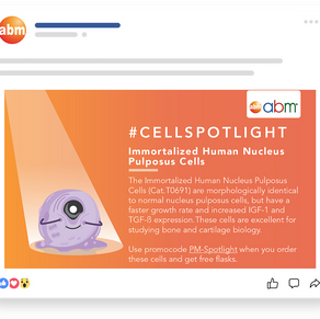
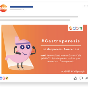
I was a part of Applied Biological Materials' Marketing department, in charge of the marketing media/content creation and design side of things. This included Visual/Graphic design, along with storyboarding for videography, editing short Marketing blurbs on banners to be the message that is presented first to potential buyers.
My responsibilities included coming up with Art Direction and potential forms of media tailored to each marketing content, work and interact within a constructive team environment, Manage and analyze the lifecycle for digital media and digital properties to present to the team, and develop and execute marketing plans and campaigns.
I was given the tasks to design visuals and banners that would potentially attract customers to purchase abm's products such as the "Growth Factors & Gifts ," "Mycoplasma Detection Kit." Like any other visual designs I'd done for abm, I've implemented visuals and illustrations that could be perceived as being more lighthearted as opposed to the stereotypical science-feel. To do this, I implemented abm's established theme which consisted of bright cartoon colors and lighthearted personification of biological elements such as cells. This was done to increase the potential interests of different buyers.

Promotion Landing Page
Design fundamentals such as hierarchical decisions were made to dictate which elements to be emphasized. For example, the headline "Flash Sale" and "Buy 1 Get 1 Free..." were made significantly bigger than other texts, creating a contrast that would not be missed by the audience. The timer and promo codes were the 'catalysts' that give the audience a need to immediately purchase the product.

S.O.I.L. Magazine
S.O.I.L. magazine aimed to provide readers with environmentally conscious ways of living by promoting a sustainable lifestyle.
In an effort to both promote and encourage a healthy, sustainable lifestyle, S.O.I.L.'s overall look featured an abundance of white space and secondary color cues, either organic green or maple brown, symbolizing nature and the magnificence of healthy living. The whitespace conveyed a sense of clarity, cleanliness, and spaciousness, while the organic colors served as reminders of nature and the magazine's intended theme. The design employed postmodern minimalism to accentuate the clean layout, making S.O.I.L. appealing not only to green enthusiasts but also to professionals.
In my role as the art director of S.O.I.L., I was responsible for designing the magazine's overall visuals, including the placement of advertising and media content. These decisions were made based on observation and user experience-based research to deliver the most compelling visual product to our readers.
As a result of our efforts, S.O.I.L. received recognition from a panel of judges during the project showcase and was awarded the title of "best art direction of the night."
Lingyen Vegetrian Recipe Book 2
My role Art Director
I was responsible for crafting designs for both the covers and interiors of this 123-page recipe book, meticulously ensuring it adhered to the publisher's aesthetic standards. Additionally, I took charge of editing and color grading all the images, meticulously ensuring their consistency and a cohesive look throughout the book.


